process
Coquitlam River Community Garden Website Redesign
💻 Website Redesign, UX Research, UX Design, UI Design, Design Leadership
🛠️ Figma, Miro, Sketching, Photo editing software, Google Suite
💼 Self-initiated pro-bono volunteer project for local NFP
🗓️ 5 months
Overview
The Coquitlam River Community Garden, formerly known as the Colony Farm Community Garden, is a not-for-profit organization dedicated to promoting sustainable and organic gardening while fostering a strong sense of community. The organization had been in need of a website redesign for three years. As a member and gardener at the time, I volunteered to take on the project. The state of the website in January 2023, the time of starting this project, is linked here.
My Role
I led the website redesign project by conducting user research, identifying usability issues on the existing site, and creating high-fidelity mockups for the new design. I coordinated responsibilities within a team of three, which included myself, the garden president, and the webmaster. Additionally, I presented progress updates to both the community garden president and the administrative assistant.
User Research
Usability Assessment
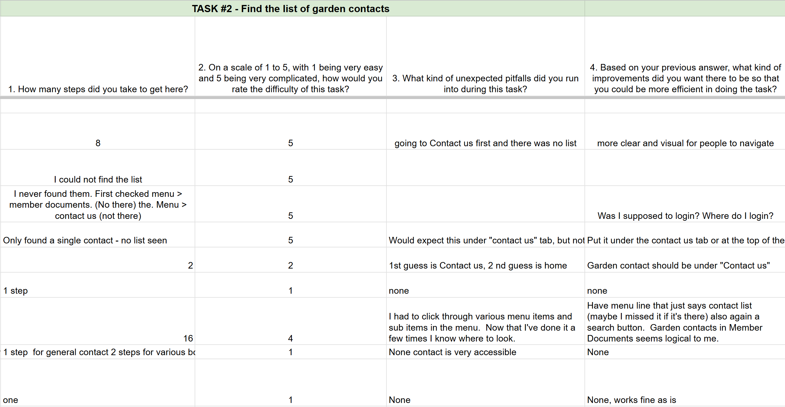
I created the script for the website usability assessment to evaluate the initial usability of the CRCG website. The script focuses on user acceptance testing, including three key tasks:
- Task 1: Locate the item “Plot #10 – Artichokes.”
- Task 2: Find the list of garden contacts.
- Task 3: Identify the date of the first work party in 2024.
The assessment was conducted via Google Forms and distributed to five garden members and one external tester. Participants were diverse in age, tech proficiency, and English language skills. Including an external participant provided insights into the experience of prospective new members seeking to contact the admins or register for a plot. Full script is linked here.
Competitive Analysis
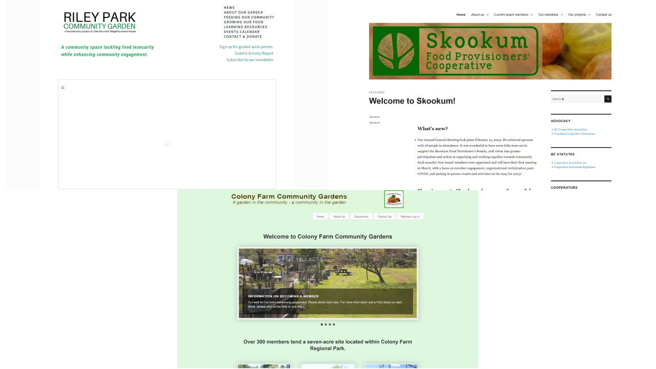
The Riley Park Community Garden and Skookum Foods Co-op websites were compared against the CFCG old website.
A competitive analysis was performed to identify potential features and strategies by examining other community gardens and equivalent organizations. This process inspired feature identification, rationalization, benchmarking, trend awareness, and UX enhancement.
Key competitors included Riley Park Community Gardens and Skookum Foods, both of which had significantly more polished websites.
The methodology involved:
- Feature Comparison Chart– Highlighting features competitors offered that CRCG lacked or could improve.
- Task-Based Analysis – Evaluating three common tasks:
- Reading about the mission or history of the organization.
- Accessing documents with learning resources.
- Registering for membership.
For any tasks without a direct equivalent, the closest match was analyzed. Steps were recorded for each task, along with their actions, and evaluated against Nielsen Norman’s 10 Usability Heuristics to identify violations and areas for improvement.
Findings and Opportunities
Usability Assessment Findings
- Search Bar
- Issue: The lack of a search bar made it difficult for users to locate specific items using keywords.
- Action Item: Add a search bar to the website.
- Demo Plots
- Issue: The demo plots were buried in the website hierarchy, despite being a valuable resource for understanding what plants grow well in specific conditions.
- Action Item: Highlight demo plots prominently on the landing page.
- Contact Information
- Issue: Users expressed frustration over excessive clicks required to find contact information.
- Action Item: Make contact info easily accessible from the homepage.
- Document Categories
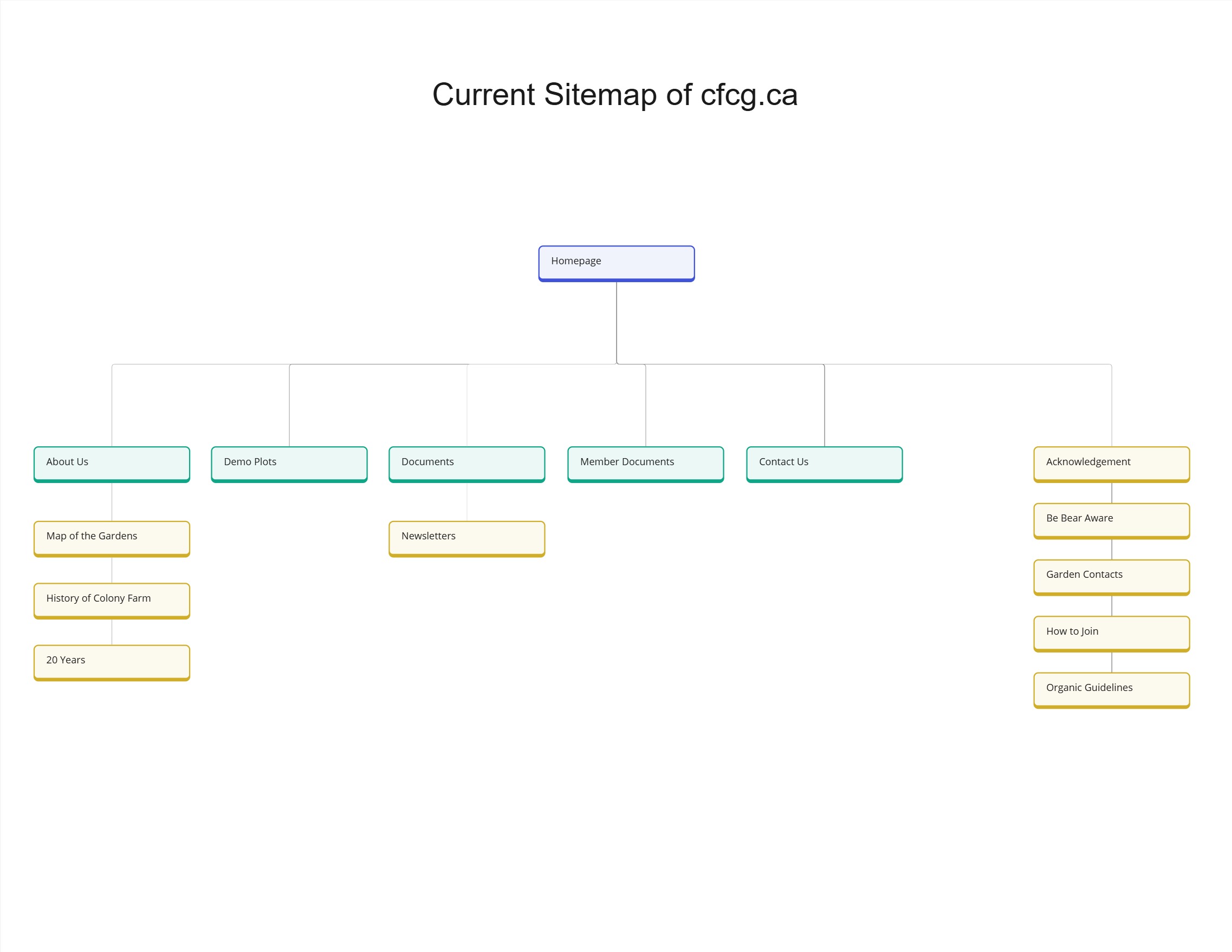
- Issue: The distinction between "Documents" and "Member Documents" was unclear, as there were no plans to implement member login authentication.
- Action Item: Merge "Documents" and "Member Documents" into a single category.
- Event Calendar and Work Party Registration
- Issue: Users wanted an easy-to-navigate event calendar and a way to register directly for specific roles at work parties.
- Action Item: Add a prominently placed calendar and integrate a role-specific registration feature.
Competitive Analysis Findings
- Content Presentation
- Skookum Foods: Presented its organizational history with a clear layout and effective segmentation for readability, leveraging font styles to differentiate sub-headings.
- RPCG: Organized learning resources using clickable topic tiles with accompanying visuals for an engaging experience.
- Streamlined Processes
- Skookum Foods: Simplified membership registration through a concise form and an easy-to-locate "Send" button, avoiding unnecessary external account creation.
Opportunities for CRCG Website
By addressing usability issues and adopting best practices from competitors, the CRCG website can:
- Improve content readability and navigation.
- Offer streamlined access to resources and registration features.
- Enhance the overall user experience by incorporating intuitive design elements.
For detailed research findings, feel free to contact me.
💡How might we improve the accessibility and visual appeal of gardening resources while ensuring a user-friendly experience for individuals with varying levels of digital proficiency?
Information Architecture
Current Site Map
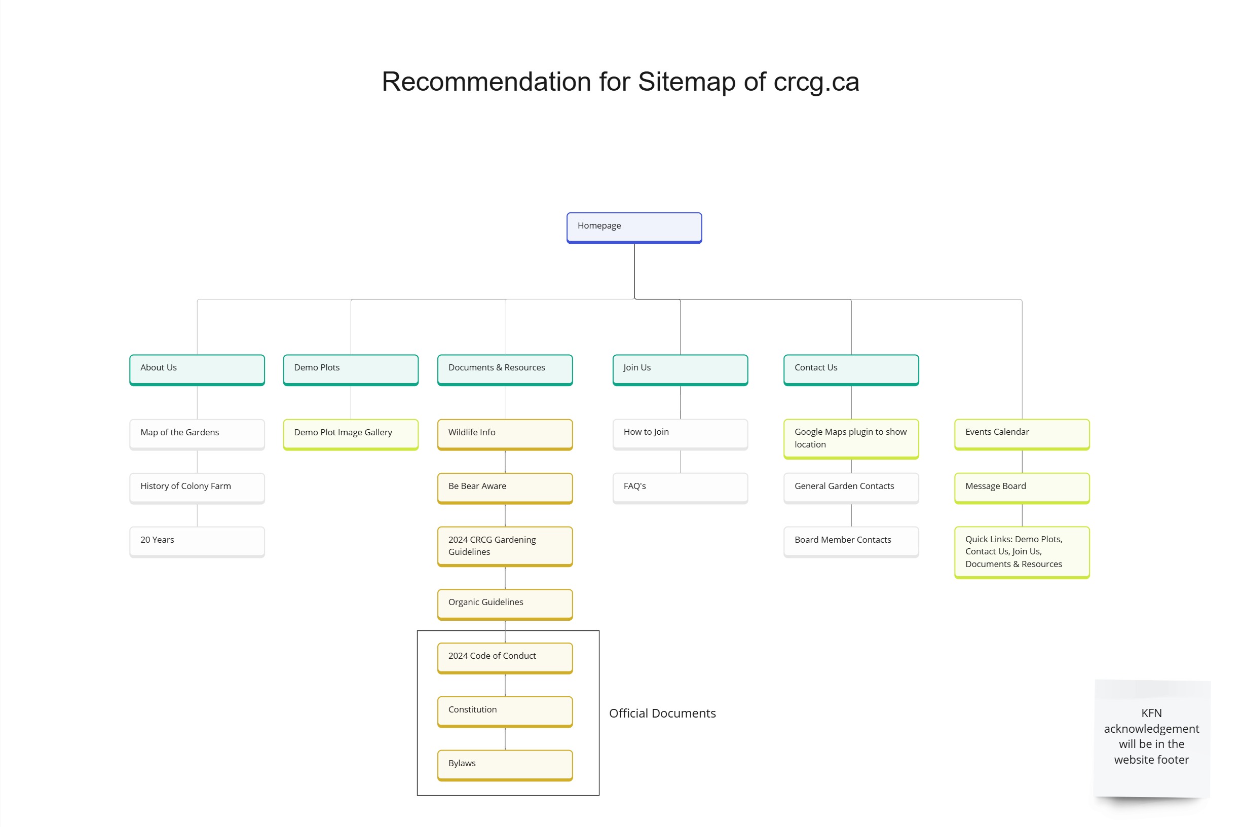
Proposed Site Map
Based on the usability testing results, I restructured the information architecture with the following updates:
- Demo Plots
- Added as a direct link on the landing page for easy access.
- Document Consolidation
- Combined all documents into a single page to reduce confusion between "Documents" and "Member Documents."
- Quick Links
- Included a series of quick links on the landing page, directing users to the most commonly searched pages for faster navigation.
- Indigenous Land Acknowledgement
- Added a Kwantlen First Nations acknowledgement in the footer, ensuring its presence across all pages.
Ideation
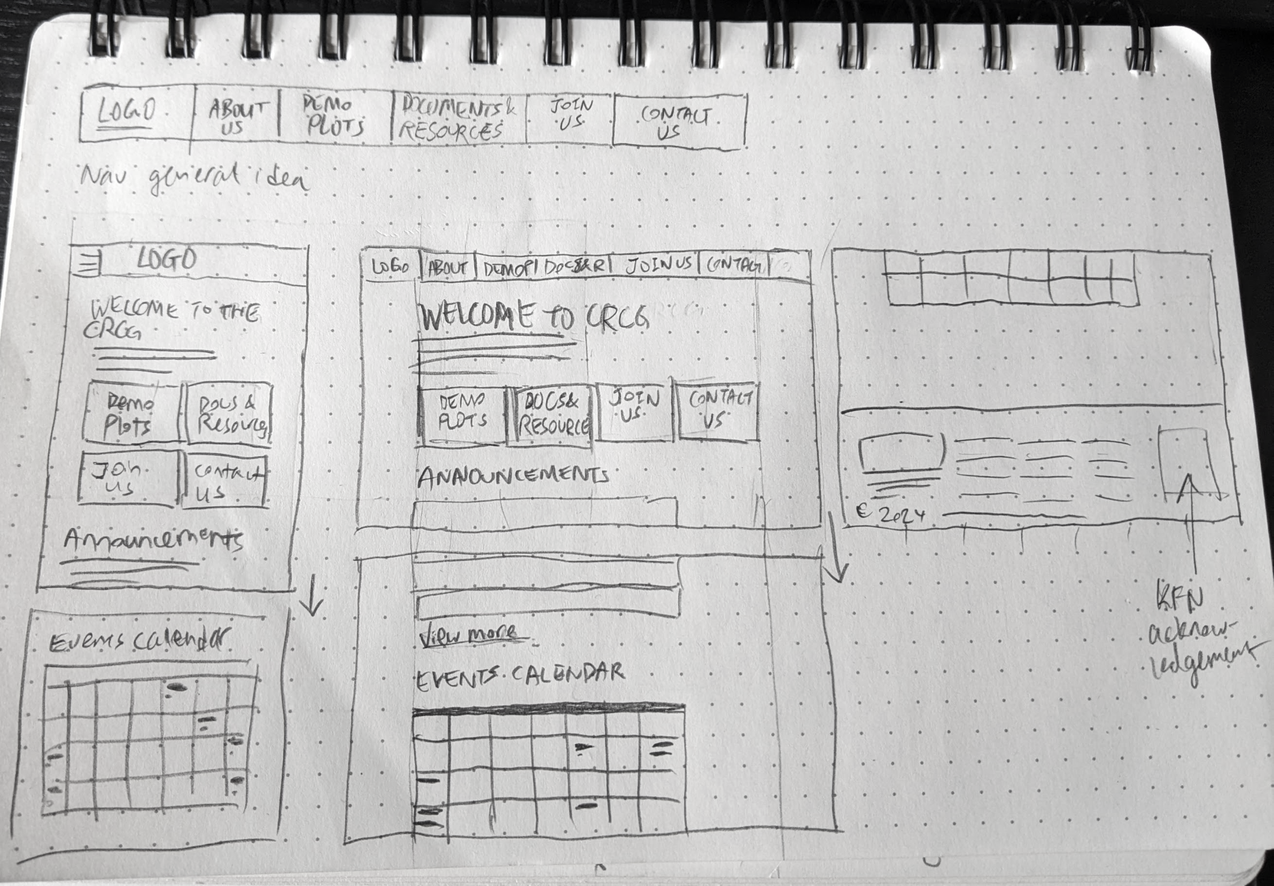
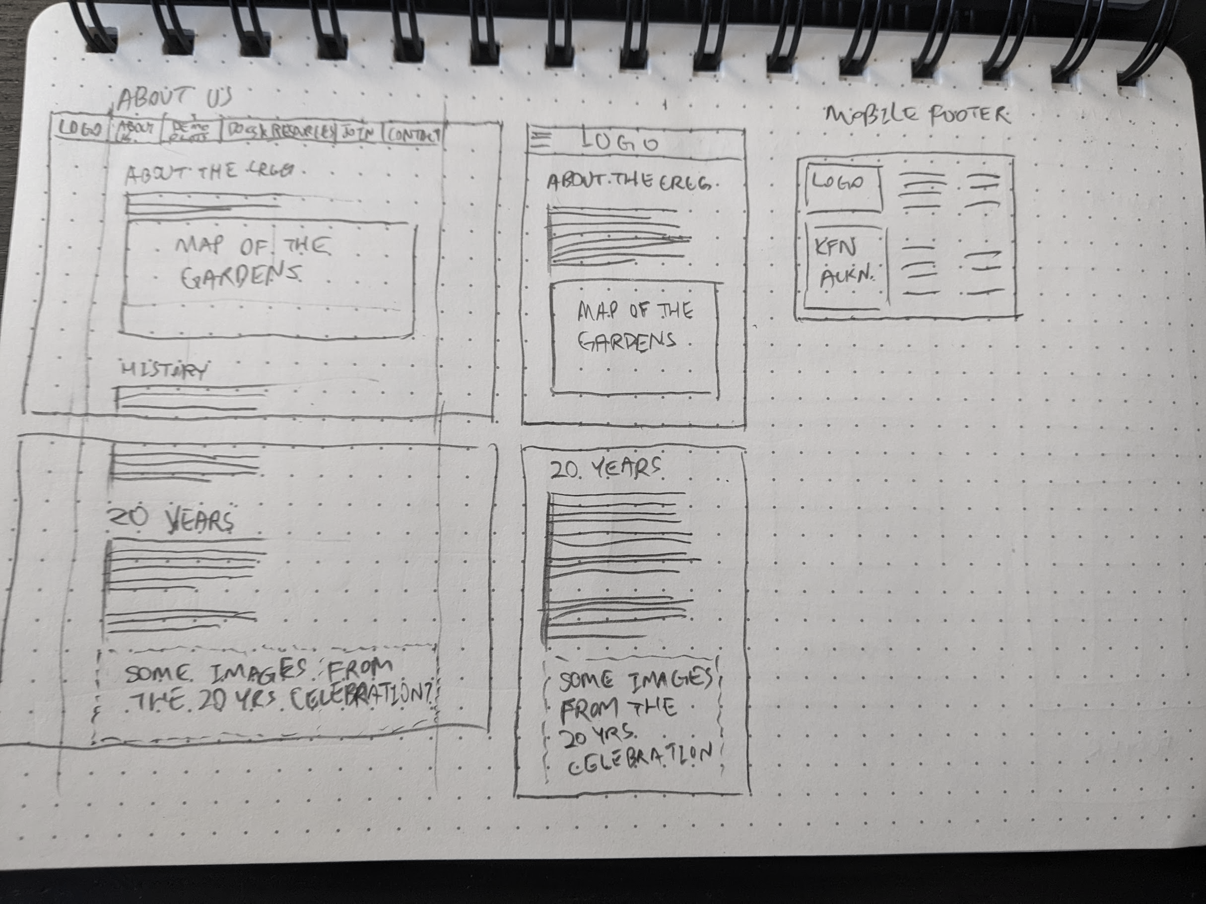
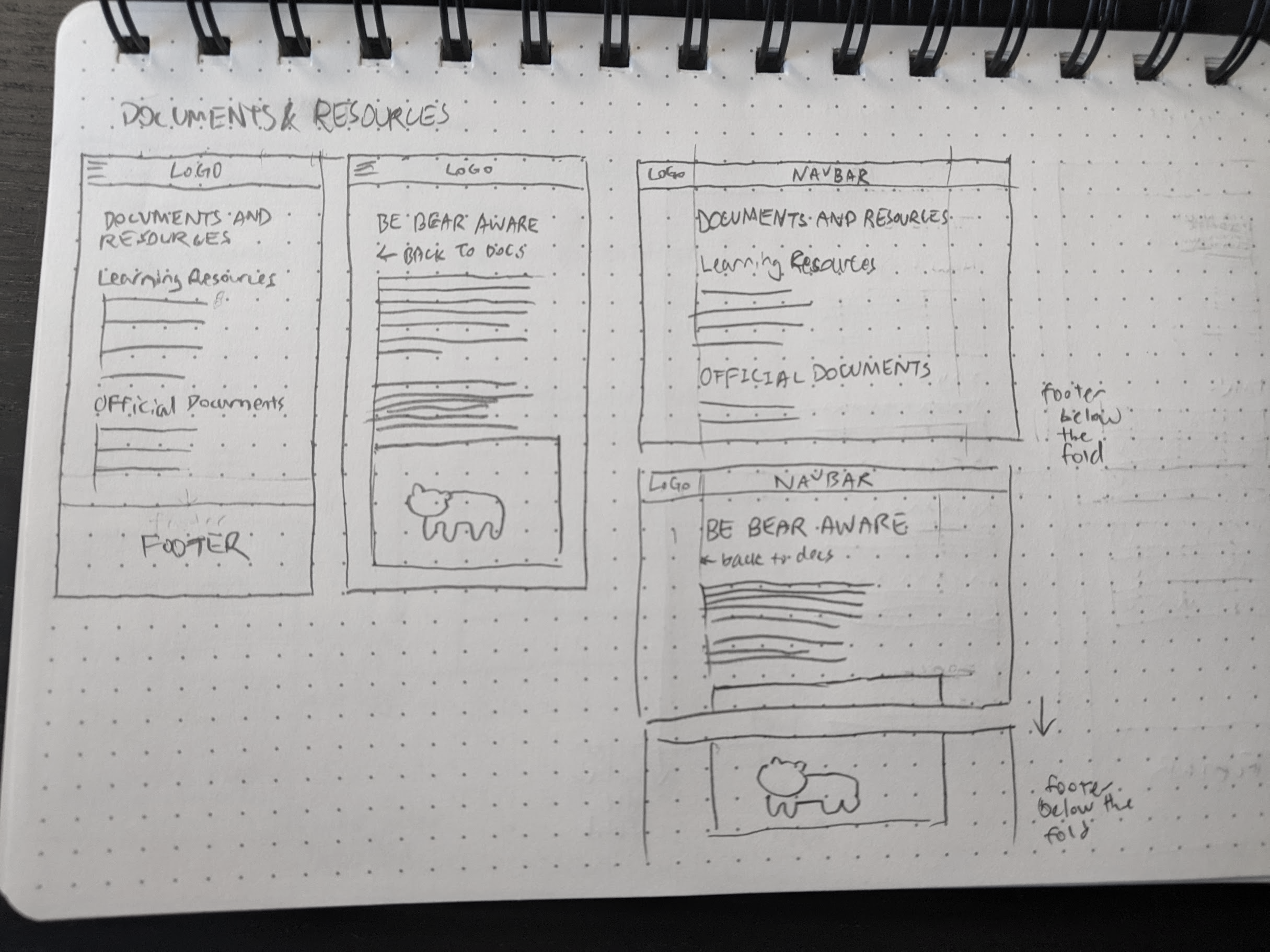
Wireframe Sketches
I created a series of wireframe sketches to explore layout, grid structures, and the general feel of the redesigned website. These sketches guided decisions around placement and content hierarchy before transitioning to a digital design platform like Figma.
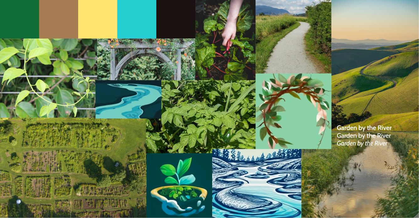
Moodboard and Colour Palette
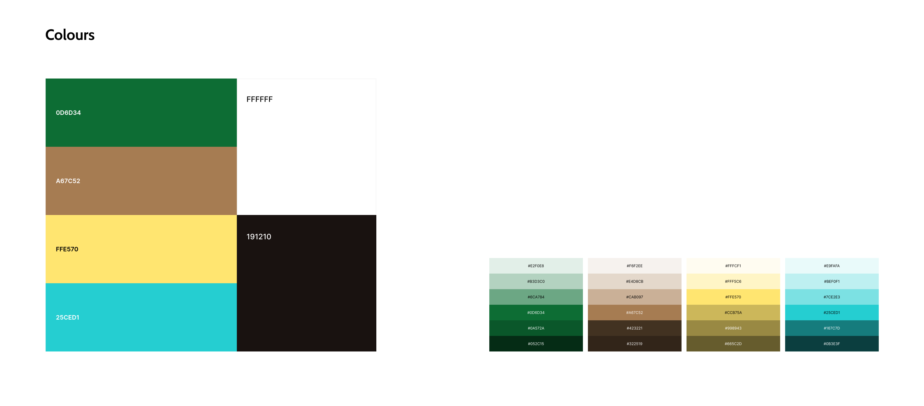
The visual design was inspired by a moodboard centered around the theme “Garden by the River.” The moodboard’s natural tones guided the selection of a colour palette with nature-derived hues.
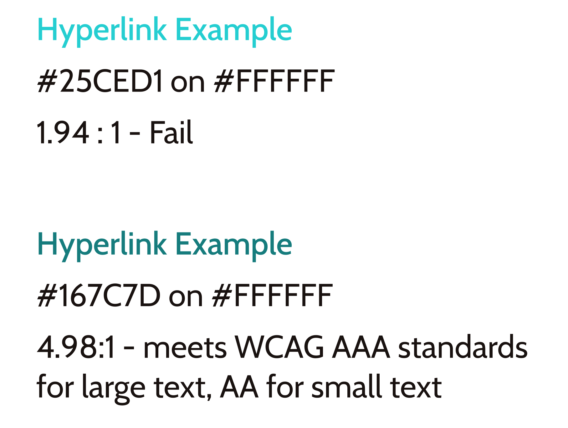
A darker shade of blue was chosen for hyperlinks to meet WCAG AAA standards, ensuring readability for users who may have challenges with vision.
Typography
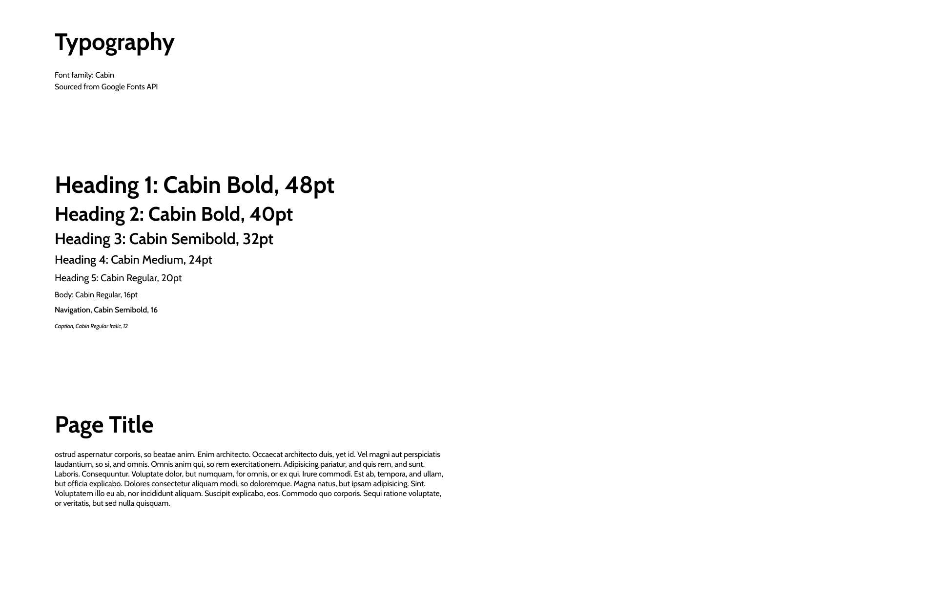
The chosen font for headings, body text, and captions is Cabin from the Google Fonts API. This typeface was selected for its readability and accessibility, aligning with the needs of the target user group.
Assets were input into Realtime Colours to visualize the output of the hi-fidelity mockups.
Hi-Fidelity Mockups
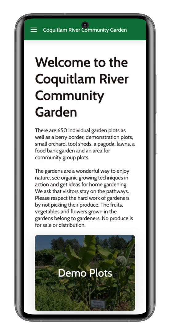
Click on the images to view interactive mockups on Figma
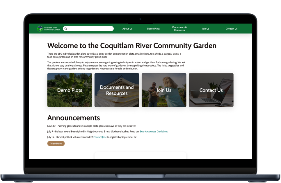
Figma Interactive Mockups for Desktop
Calendar UI in desktop mockups is based on Calendar - Auto Layout.
Takeaways
Accessibility Focus: Designing for an audience that is predominantly senior-aged required careful consideration of accessibility standards, such as WCAG contrast compliance and user-friendly features.
Collaborative Leadership: My role was to guide the team by sharing my expertise, not imposing decisions. I took an active leadership role by:
- Allocating duties, such as organizing participants for user research.
- Teaching UX and design principles, emphasizing their importance to the project.
- Actively gathering team input to align the website’s vision with their goals.
- This experience reinforced the importance of balancing expert guidance with collaborative decision-making to achieve a shared vision.
Future Considerations
- The team plans to adopt the tool Signup Genius to streamline work party registration, a feature that aligns with my usability suggestions.
- Though the Google Translate browser extension can be utilized to support users with English as a non-native language, there had been discussion for utilizing translation tools for larger PDF files that cannot be immediately converted to a webpage (ie. bylaws).
- The website is currently being updated in stages based on my recommendations.
Extended Design Work
Logo Redesign - For more information, contact me
Timeline Infographic - For more information, contact me

