process
Sticky Notes Annotation for eReading
💻 UX Design, UI Design, Product Research, Prototyping
🛠️ Figma, video conference presentation
💼 Feature for development sprint
🗓️ 2 Weeks
Overview
Sticky notes is a design feature for the company’s flagship web-based reader. The reader is rapidly developing to better accommodate online learning and adapt to the unprecedented educational landscape of the COVID-19 pandemic.
Inspiration
One of our clients wanted an annotation feature where students can write notes for themselves. The notes would always present on top of text and draggable across the page. Along with the design team, upper management decided to revisit the current version of sticky notes and make improvements.
My Role
- Research sticky notes equivalents in other contexts to better understand how to improve the current sticky notes feature by adding new features and adjusting existing features.
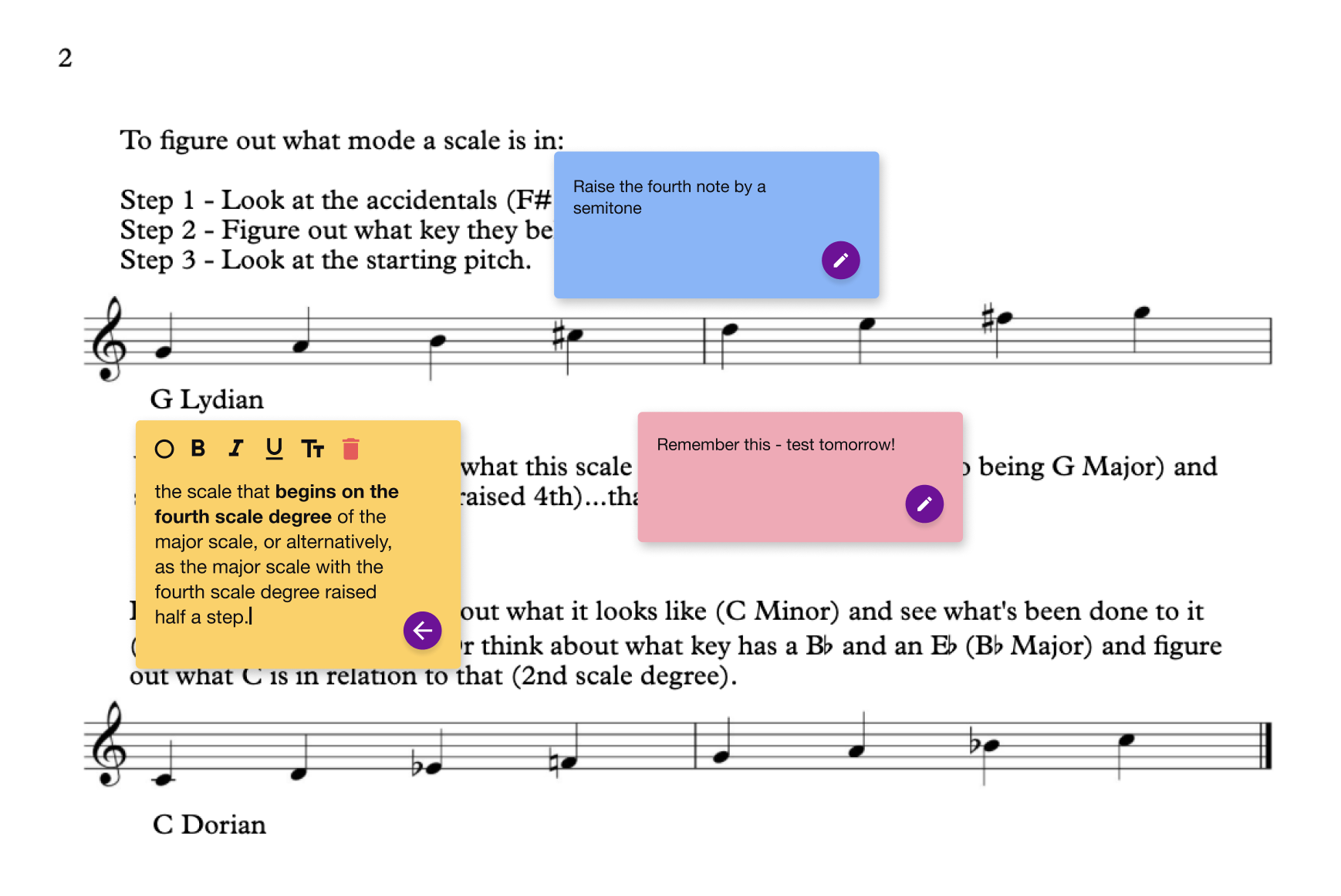
- Design a set of mockups showing a new iteration of sticky notes and display it in all states in a reader mockup
Initial Findings
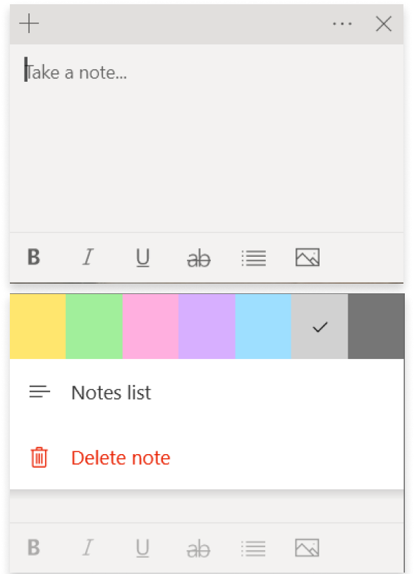
I did a quick audit with the current version of sticky notes and managed to find both visual and usability problems.

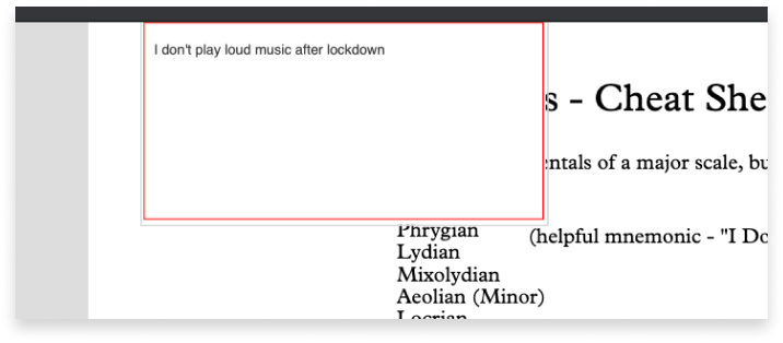
Since there is no minimum size for the note, the user could create a note so small that it becomes very difficult to see what they are writing.
Visual Challenges
- Icon on the left toolbar does not resemble a sticky note.
- Not unified with the reader's overall design.
- Editing tools are too visually far from the actual sticky note.
- No minimum size for the input area.
- Can make sticky notes any size --> leads to usability problems.
💡 Top Usability Challenges
- Absence of minimum sticky note size causes problems with visibility of input text and accessibility of editing tools.
- Need editing functionality that can help the user personalize how they use the sticky notes in their books.
Ideation
To get an idea on improving the current version of sticky notes, I researched the sticky notes on different operating systems and noted specific functionalities that I wanted to transfer to sticky notes in the reader
Apple OS --> Toggle minimize/default/maximize
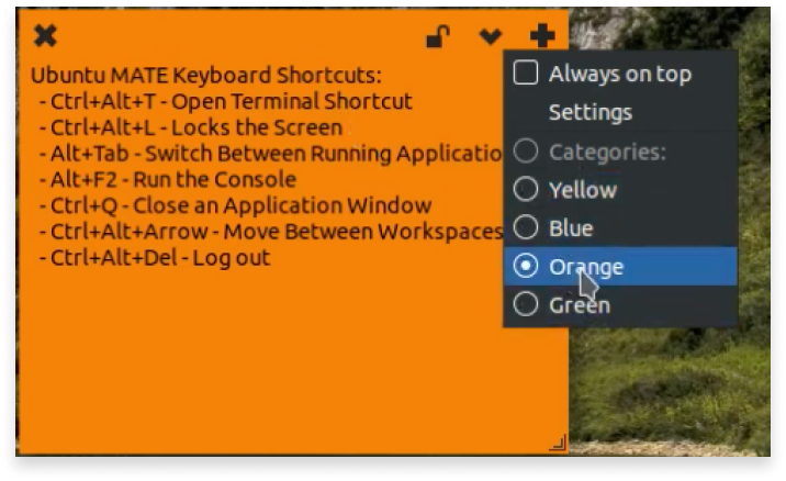
Linux OS --> Lock a note
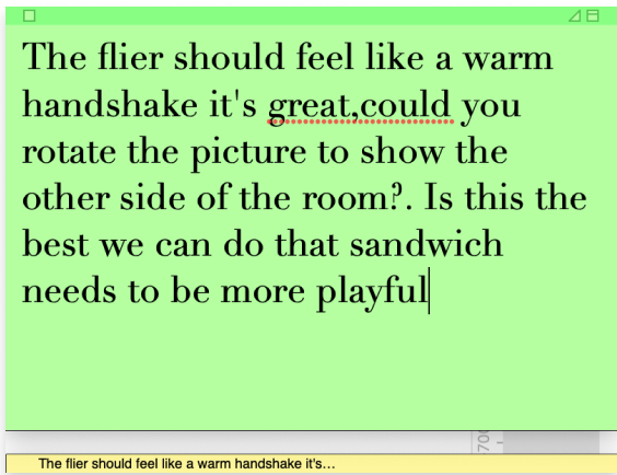
Windows OS --> pressing X closes the note instead of deleting it
Product Improvement
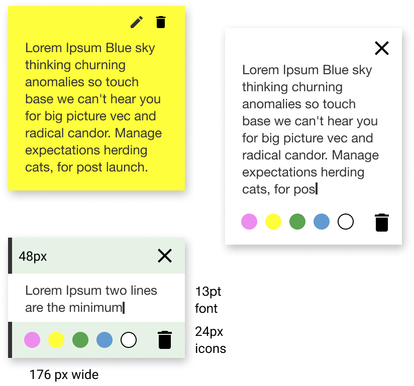
My teammate did previous groundwork on the sticky notes, so I built upon that work by including the minimize and lock features. To address the previous dimension problem, it was decided that the note will be sandwiched between a top and bottom area, 48px tall each, which will support the editing/deletion buttons and note colours. When creating a note, the initial input area height will be enough for two lines of text.
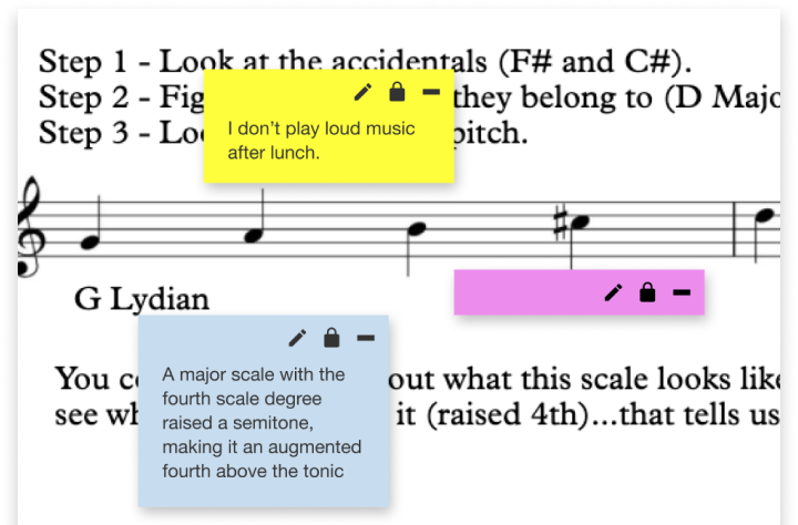
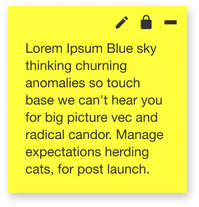
Another design I created includes a feature to lock the note to prevent accidental editing, and the ability to minimize a note in case the user wanted to focus on reading. In this design, the delete functionality is within editing mode.
Final Iteration
After presenting the above designs, the decision was made to keep the note simple without the lock and minimize feature, as it was too early to implement them. We were also uncertain if they would be useful, as most of our users who utilized notes liked to keep them open.
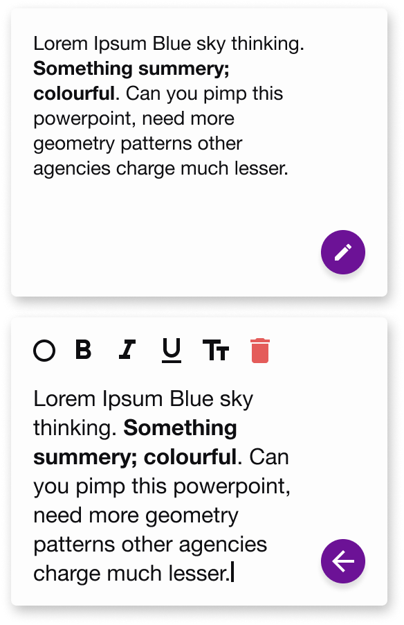
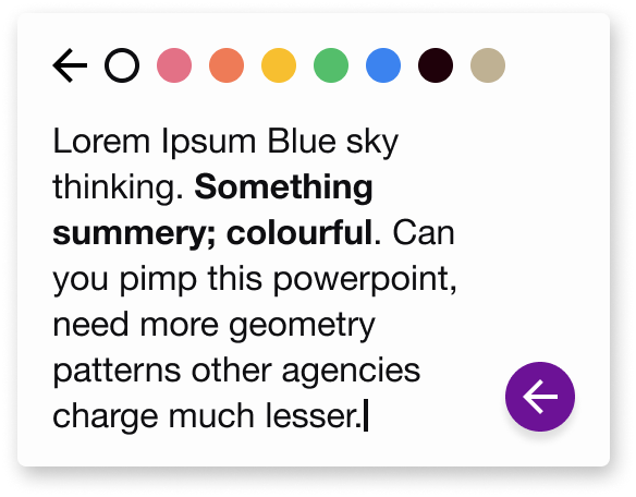
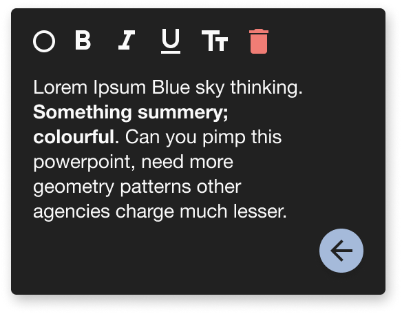
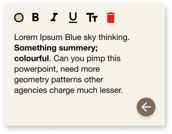
As the previous UI cluttered the editing and deletion tools, the decision was to make a single floating action button that changes functionality depending on the note’s state. Rich text tools were implemented to support accessibility needs, such as font size. Due to the need for more icons, the colour selection menu was redesigned to expand out.
Takeaways
The above mockups were proposed to clients in a Zoom meeting, and they felt positively about the direction that sticky notes were going. They recommended an article about the usability research done on note-taking, which I plan to draw knowledge from when working on future iterations.
Future plans for sticky notes include the desire to have them privacy-scoped to specifically individual users, other students, and teachers. If we make this feature available to different clients, we could also implement their branding colours as background colours for the notes.
