process
Prerequisite Building Tool
💻 Product Redesign, UX Design, UI Design
🛠️ Figma, Sketching
💼 Feature redesign for development sprint
🗓️ 1 month
Overview
In the Learning Management System (LMS) web application, courses are managed for different customers that procure course materials that Pelesys provides. This project focuses on redesigning the outdated prerequisite-building tool embedded within one activity of a course in the Learning Management System (LMS). This tool is used by administrators to set conditions for unlocking specific activities, nested courses, or blocks within a course's hierarchy.
Key Concepts
-
Activity: A module within a course that serves as a building block of the overall learning experience, customized by Pelesys or by the customer’s administration team.
-
Prerequisite: A set of conditions that must be met to give the trainee access to a specific activity or module within the course.
My Role
I was responsible for modernizing and enhancing the user experience of the prerequisite-building tool, replacing the outdated version in the old UI with a design that is intuitive, functional, and visually engaging.
Existing Challenges
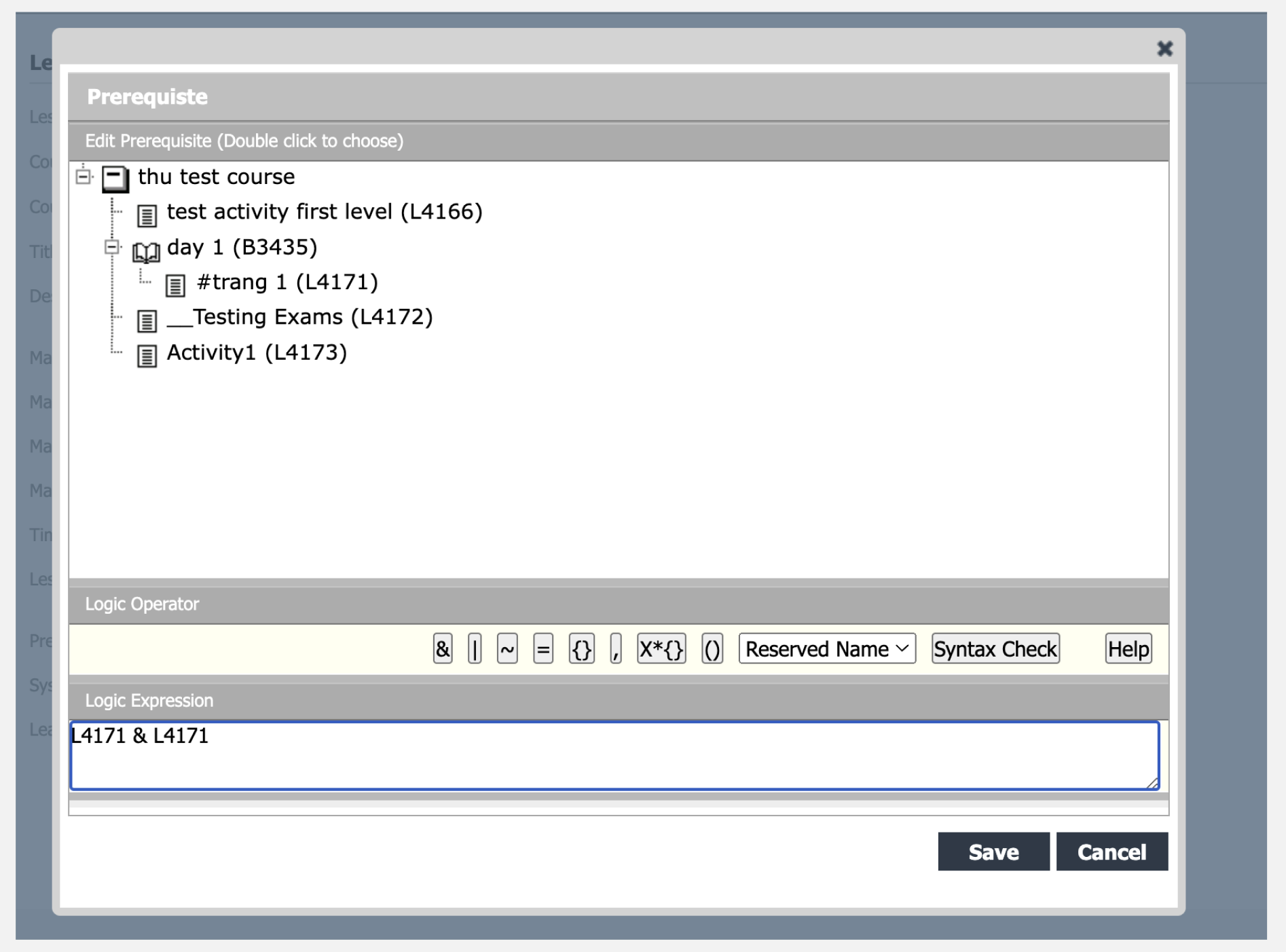
The existing prerequisite-building tool was part of the legacy Galaxy system, which hadn’t undergone a UI revamp since the 1990s. This outdated design presented several significant challenges that hindered usability and frustrated administrators.
Key Issues
-
Rigid Functionality
-
The interface lacked flexibility, making it impossible to rearrange operators or the items being operated on after placement.
-
-
Crammed and Confined Layout
-
The entire tool was squeezed into a small modal. Although a drag handle allowed some resizing, the cramped space made it difficult to work comfortably.
-
At least two customers explicitly requested moving away from modals, citing usability concerns.
-
-
Unintuitive Operator Buttons
-
The buttons for adding operators (e.g.,
AND,OR,NOT) were tiny and difficult to click, leading to frequent user frustration.
-
-
Inefficient Syntax Checking
-
Syntax validation was not live. Users had to click a button every time they wanted to check their expression, adding unnecessary steps and slowing down their workflow.
-
-
Insufficient Support
-
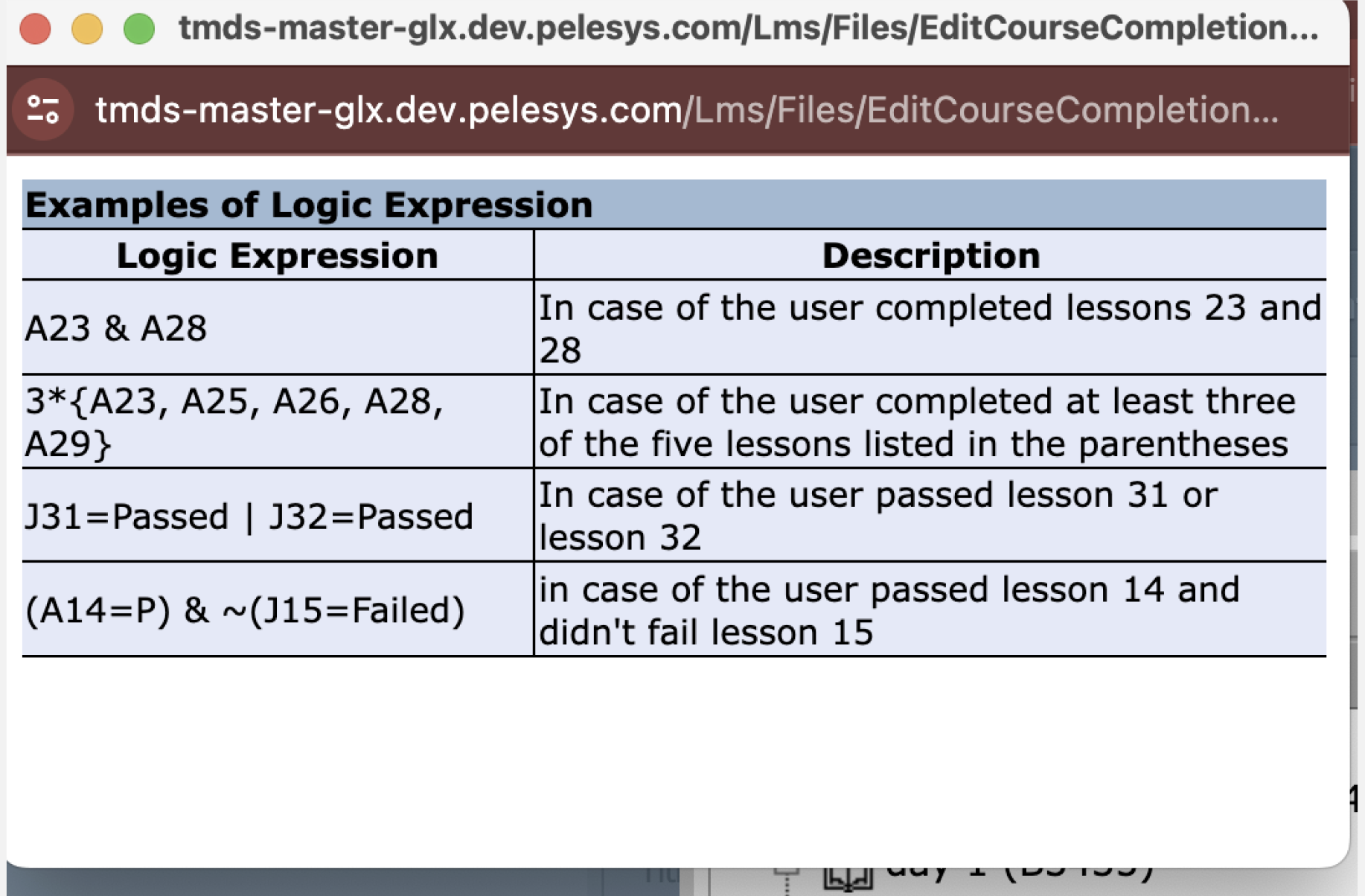
The only guidance available was four static examples of valid expressions, accompanied by basic descriptions of what they meant.
-
There was no way to get help with individual operators or symbols, leaving users stranded if they didn’t fully understand the tool's syntax or logic.
-
💡How might we redesign the prerequisite building experience to be flexible, legible, and error-resilient?
Inspiration
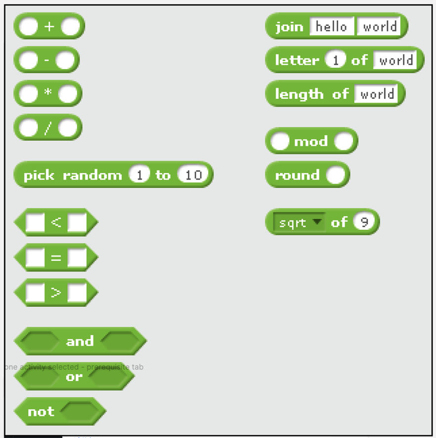
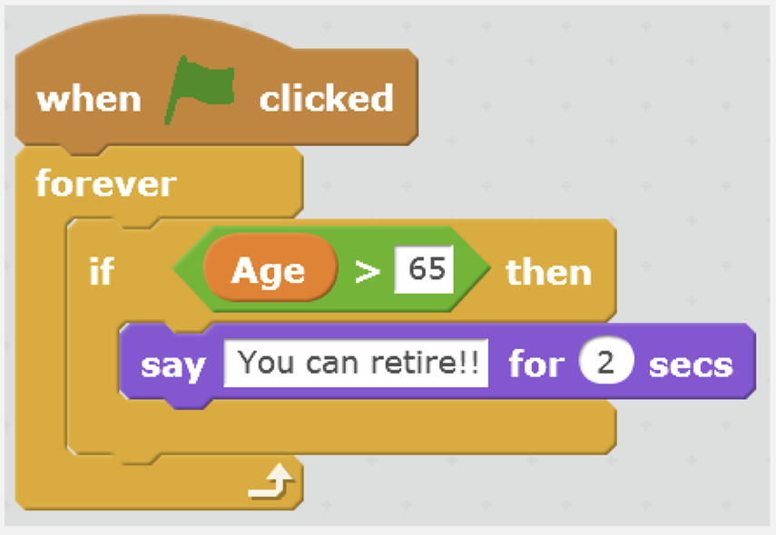
The primary source of inspiration for this project was Scratch, a block-based programming language designed for children who are receiving their first exposure to computer programming. Its Object-Oriented Programming (OOP) approach is colorful, user-friendly, and emphasizes clarity. Key takeaways from Scratch included:
-
A visual approach to optimize readability.
-
Clear differentiation of elements through colours.
-
Reducing cognitive load by minimizing reading time due to clear visual differentiation of nesting.
-
Drag-and-drop functionality for ease of use.
Ideation
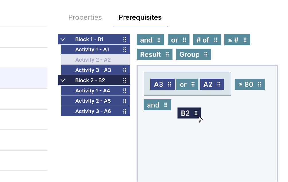
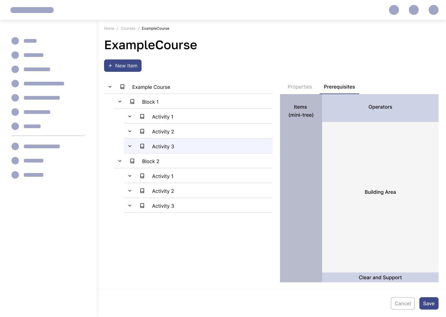
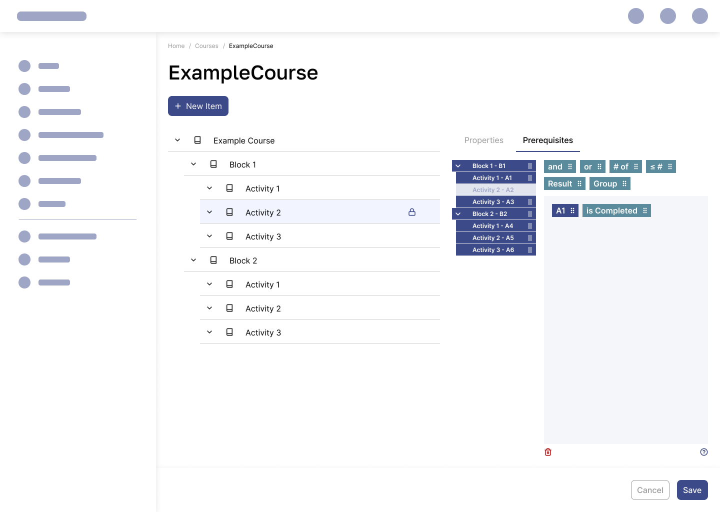
To align with the goals of this redesign, I conceptualized a drag-and-drop interface. Here’s the structure I devised for the prerequisite sub-tab:
-
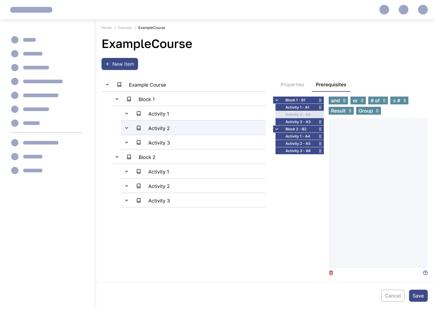
Operators: These include
AND,OR,NOT,result, andparentheses(later replaced by Groups for clarity). They are housed at the top of the view. -
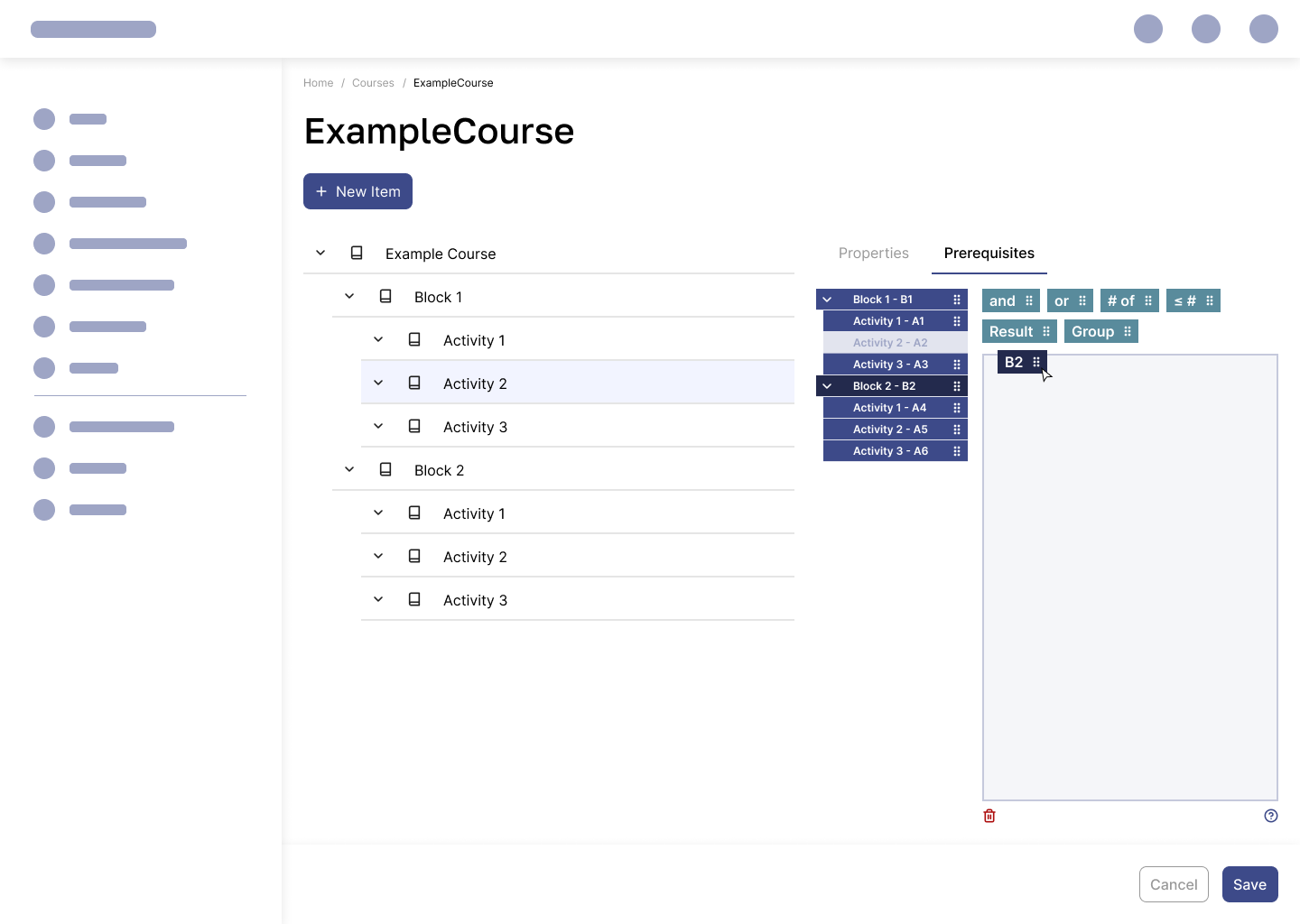
Mini Tree: A compact representation of the course structure. Each element has a unique short code. These elements are static and cannot be reordered but can be dragged into the building area.
-
Builder Area: The primary workspace where operators and elements from the Mini Tree combine to form prerequisites.
-
Utility Buttons: Positioned at the bottom, they allow users to clear the Builder Area and access support documentation.
Design Considerations
-
The Mini Tree remains unalterable while the builder is active to ensure users can focus solely on creating prerequisites without fear of accidental changes to the course structure.
-
A deliberate arrangement of sections encourages logical flow and user focus.
Improvements
-
Enhanced Visual Clarity
-
Replaced parentheses with Groups to simplify scope visualization and make the tool more intuitive.
-
Limited nesting to two levels to reduce complexity and confusion in large course hierarchies.
-
-
Revamped Support Documentation
-
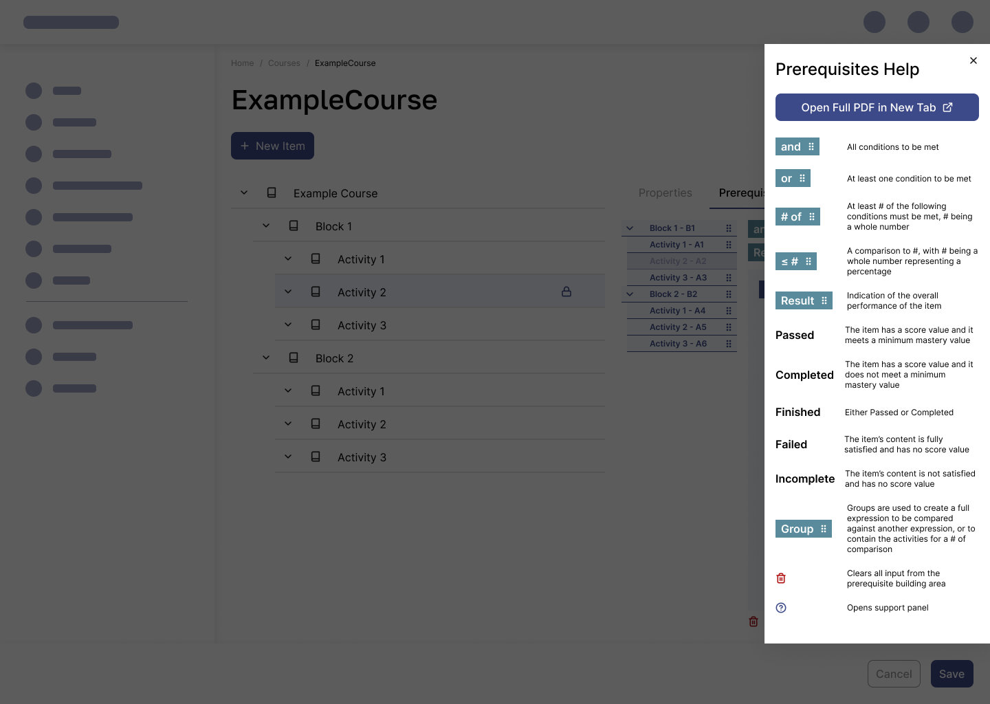
Expanded from a sparse collection of four examples to a detailed, interactive panel that explains each operator and result option.
-
Integrated the documentation into the interface via a side panel for easy reference. An extended version was also created as a PDF accessible in a new tab.
-
Hi-Fidelity Mockups
Examples of use cases of the redesigned tool:

Either activity A3 must be completed or passed, depending on if the system finds a score value associated with it, or A2 must have a score less than or equal to 80%
Grouping Example:
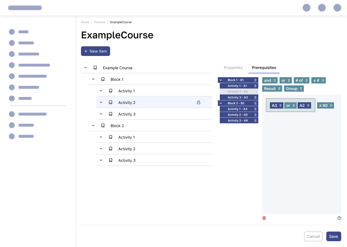
Activities A3 or A2 must have a score of 80 or under. This scenario is common for assigning remedial or supplemental training.
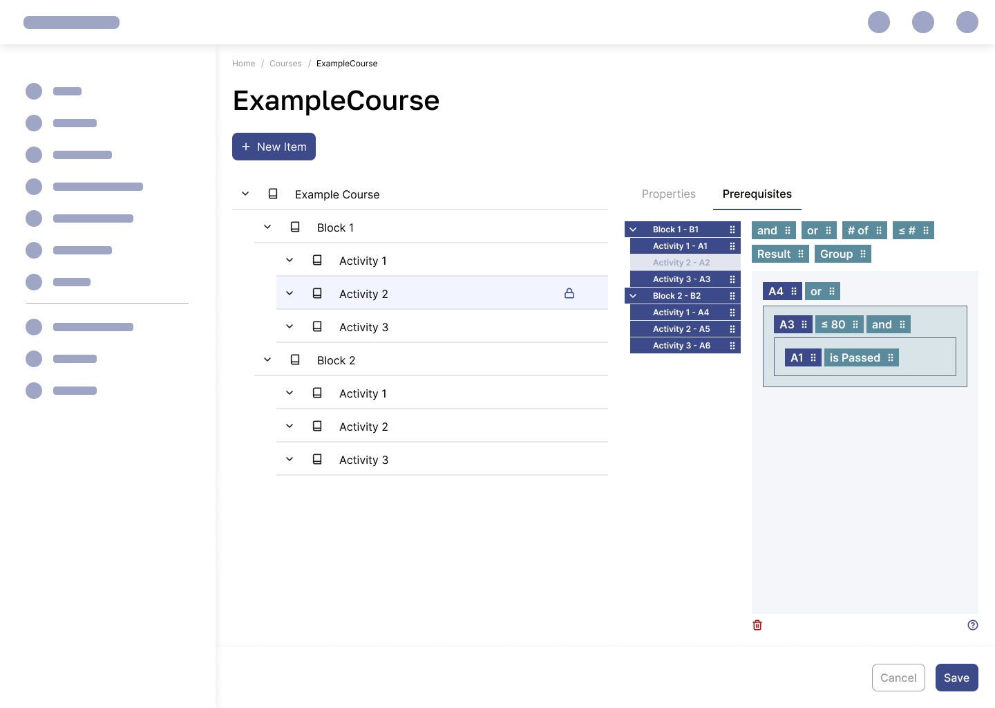
In this nested group expression, A4 must be passed or completed, or the statement inside the groups must hold. Groups are used to determine scope and maintain clarity.
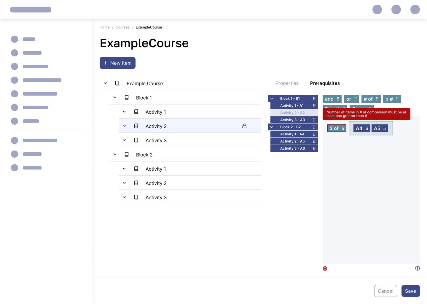
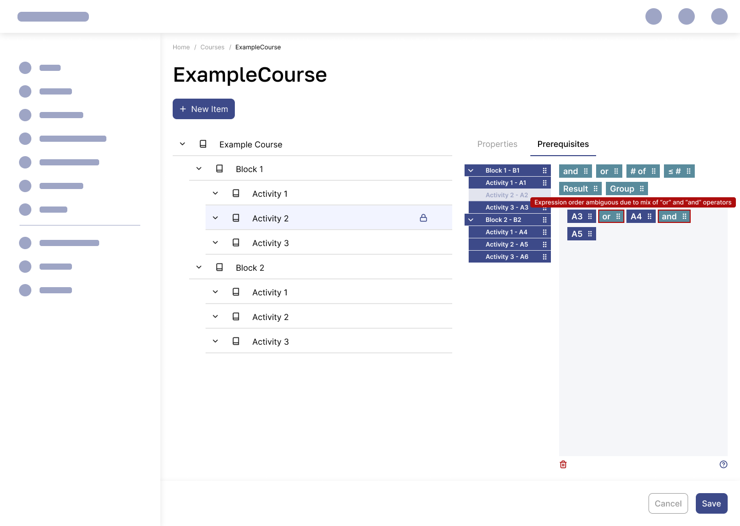
Error handling examples:
Takeaways
The transition from the old, uninspired UI to the new, user-friendly design required balancing creative freedom with strict adherence to an existing design system. Drawing inspiration from Scratch's UI, which was vastly different from my usual references, provided fresh perspectives.
Future Possibilities
The current design serves its purpose effectively but leaves room for expansion. A modal-based approach, though not favored by most of the team, could further enhance focus and usability if designed intentionally for this specific context. It would especially be the case if we were to make the LMS application available for tablets.
